
The chart above tells you just about everything you need to know about where we’ve been and where we’re going - as far as the U.S. economy is concerned, anyway.
The red line depicts American workers’ share of the national income pie, dating all the way back to 1947. As the boom and bust (or growth and retraction, if you must) nature of our capitalist economy worked its rhythmic gyrations over the years, Labor’s piece of the American Pie grew larger in good times, smaller in bad ones - but for the most part tended to recover to a baseline high of around 109 once the economy was good and cranking.
Until, that is, Ronald Reagan got into office and altered the economic landscape of the country in a way that has knelled the death of the American worker since the early 80s. The last good uptick in fortune seen by people who work for a living occurred during the Clinton administration, but even at its highest peak Labor’s relative position remained just barely above the ones it occupied during the worst recessions of the 50s, 60s and 70s.
So, when you hear people talking about “the jobless recovery” we’re experiencing right now, just look at that pitiful little fish hook hanging out above that steep cliff the Obama administration tossed US workers in 2009. That’s what a “jobless recovery” looks like.
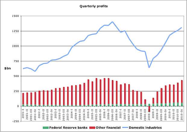
By contrast, here’s a look at financial and domestic corporate profits since 2001. Compare its shape with the freefall image depicting working people’s experience of the past decade in the previous chart.
Like I said at the outset, you don’t need to know much more than you can see right here in these two charts.
Well, that and whose side you’ll be on when things turn really ugly.


0 comments :
Post a Comment